


A design system is a set of reusable UI components and design tokens, like colors and fonts, that bridge the gap between designers and engineers. Designers use tools like Figma or Sketch to design UI components that can be reusable across multiple projects and still look cohesive. In contrast, engineers implement those components in whatever framework they choose using various tools.
The breadth of modern frontends overwhelms existing workflows. Developers must consider countless UI variations, yet aren’t equipped to develop or organize them all. You end up in a situation where UIs are tougher to build, less satisfying to work on, and brittle.
Every piece of UI is now a component. The superpower of components is that you don't need to spin up the whole app just to see how they render. You can render a specific variation in isolation by passing in props, mocking data, or faking events.
There are several ways to implement design systems within your project. You might be familiar with some existing component libraries such as Chakra, Ant design, Material UI, etc.; as good as those UI libraries are, they are also very opinionated.
Prerequisites
This tutorial assumes the reader has the following:
An existing Next.Js project
Basic understanding of Typescript
Basic understanding of Tailwind CSS
Basic understanding of React
What is Storybook?
Storybook is a tool for UI development that makes it faster and easier to build UI through its isolation of components. It allows you to work on one component at a time enabling you to be able to develop entire UIs without needing to start up a complex dev stack, force certain data into your database, or navigate around your application.
In addition to this, Storybook also helps you document components for reuse and automatically visually test your components to prevent bugs.
Initializing Storybook
We’ll use the Storybook command line interface to install it in a single command. To do this, run the command below inside your existing Next.js project’s root directory.
# Add Storybook:
npx storybook init
The command above will make the following changes to your local environment:
Install the required dependencies
Setup the necessary scripts to run and build Storybook
Add the default Storybook configuration
Add some boilerplate stories to get you started
Set up telemetry to help us improve Storybook
Installing PostCSS Add-ons
Tailwind CSS needs PostCSS to work, so we need to install the PostCSS addon from Storybook. The Storybook PostCSS addon can run the PostCSS preprocessor against your stories in Storybook. Install this addon by adding the @storybook/addon-postcss dependency
yarn add -D @storybook/addon-postcss
After installing the add-on, we need to add it to the array of add-ons we have in our .storybook/main.js
module.exports = {
  addons: ['@storybook/addon-postcss'],
};
Initializing TailwindCSS
Install tailwindcss and its peer dependencies via npm or yarn, and then run the init command to generate both tailwind.config.js and postcss.config.js
yarn add -D tailwindcss postcss autoprefixer
npx tailwindcss init -p
To configure your template paths, add the paths to all your template files in your tailwind.config.js file
/** @type {import('tailwindcss').Config} */
module.exports = {
  content: [
    "./src/pages/**/*.{js,ts,jsx,tsx}",
    "./src/components/**/*.{js,ts,jsx,tsx}",
  ],
  theme: {
    extend: {},
  },
  plugins: [],
}
Add the @tailwind directives for each of Tailwind’s layers to your ./src/styles/globals.css file
PostCSS 8+
If your project requires you to use PostCSS v8, you can replace the included PostCSS in the .storybook/main.js by passing postcssLoaderOptions to this addon. After adding this, your .storybook/main.js should look like this:
module.exports = {
 stories: ['../src/**/*.stories.mdx',    '../src/**/*.stories.@(js|jsx|ts|tsx|mdx)'],
 addons: [
   '@storybook/addon-links',
   '@storybook/addon-essentials',
   '@storybook/addon-interactions',
   '@storybook/addon-a11y',
   {
     name: '@storybook/addon-postcss',
     options: {
       postcssLoaderOptions: {
         implementation: require('postcss'),
       },
     },
   },
 ],
 framework: '@storybook/react',
 core: {
   builder: '@storybook/builder-webpack5',
 },
};
For tailwind to work with our storybook components, we need to import our globals.css in the preview.js file.
import '../src/styles/globals.css';

 export const parameters = {
   actions: { argTypesRegex: '^on[A-Z].*' },
   controls: {
     matchers: {
       color: /(background|color)$/i,
       date: /Date$/,
     },
   },
 };
How to write stories
A story captures the rendered state of a UI component. It’s a function that returns a component’s state given a set of arguments. Here is an example:
button.component.tsx
import { ButtonHTMLAttributes, FC, MouseEventHandler, ReactNode } from 'react';

export interface ButtonProps extends ButtonHTMLAttributes<HTMLButtonElement> {
 type: 'button' | 'submit' | 'reset';
 className?: string;
 variant?: string;
 disabled?: boolean;

 /** Provides a text for the button */
 children: ReactNode;
 onClick?: MouseEventHandler<HTMLButtonElement>;
}

const Button: FC<ButtonProps> = ({
 type,
 children,
 className,
 variant = 'default',
 disabled,
 onClick,
 ...rest
}) => {
 const variants: Record<string, any> = {
   primary: 'bg-primary-1 text-white px-7 py-2',
   default: 'bg-white text-tertiary-1 hover:bg-gray-2 px-7 py-2',
   secondary: 'bg-primary-5 text-white px-7 py-2',
 };

 return (
   <button
     type={type}
     onClick={onClick}
     {...rest}
     disabled={disabled}
     className={`font-grotesk text-base font-semibold ${className}        ${variants[variant]}`}>
     {children}
   </button>
 );
};

export default Button;
A component’s stories are defined in a story file that lives alongside the component file. The story file is for development only, and it won't be included in your production bundle.
We define stories according to the Component Story Format (CSF), an ES6 module-based standard that is easy to write and portable between tools.
The key ingredients are the default export that describes the component and named exports that describe the stories.
./stories/Button.stories.tsx
import React from 'react';
import { ComponentStory, ComponentMeta } from '@storybook/react';

import Button from '../components/Button';

export default {
 title: 'Example/Button',
 component: Button,

 argTypes: {
   backgroundColor: { control: 'color' },
 },
} as ComponentMeta<typeof Button>;


const Template: ComponentStory<typeof Button> = (args) => <Button {...args}>{args.children}</Button>;

export const Primary = Template.bind({});


Primary.args = {
 variant: 'primary',
 type: 'button',
 children: 'Button',
};

export const Secondary = Template.bind({});

Secondary.args = {
 variant: 'secondary',
 type: 'button',
 children: 'Button',
};
Run Storybook
To check out the stories we have written so far, add the following command to your package.json file
"storybook": "start-storybook -p 6006",
"build-storybook": "build-storybook"
To start the application we need to run the following command
yarn storybook
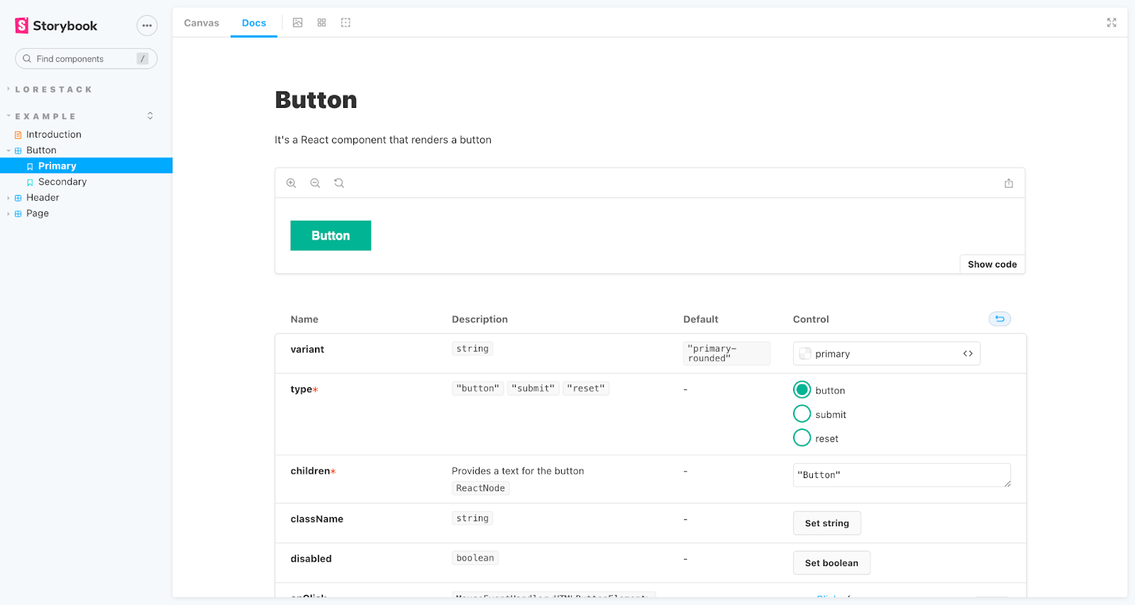
It will start Storybook locally and output the address. Depending on your system configuration, it will automatically open the address in a new browser tab, and you'll be greeted by the component page, as seen in the image
Deploying to Vercel
To deploy on Vercel, you need to create an isolated deployment with your Next.js project, then add this configuration as seen below:

After a successful deployment, you can visit the deployment url to check out your components.
Conclusion
The web’s universality is pushing more complexity into the front end. It all started with responsive web design, which multiplied every user interface from one to ten, one hundred, and a thousand. As time went on, further requirements emerged, including those for async states, accessibility, devices, and browsers.
Component-driven tools like React, Vue, and Angular help break down complex UIs into simple components but they’re not silver bullets. The main advantage of Storybook is to help build UI components in isolation, in that you don’t need to spin up the whole application to see how your components render.
If you encounter any issues trying to replicate the example in this post, please do well to leave them in the comment section. Happy Coding!💪